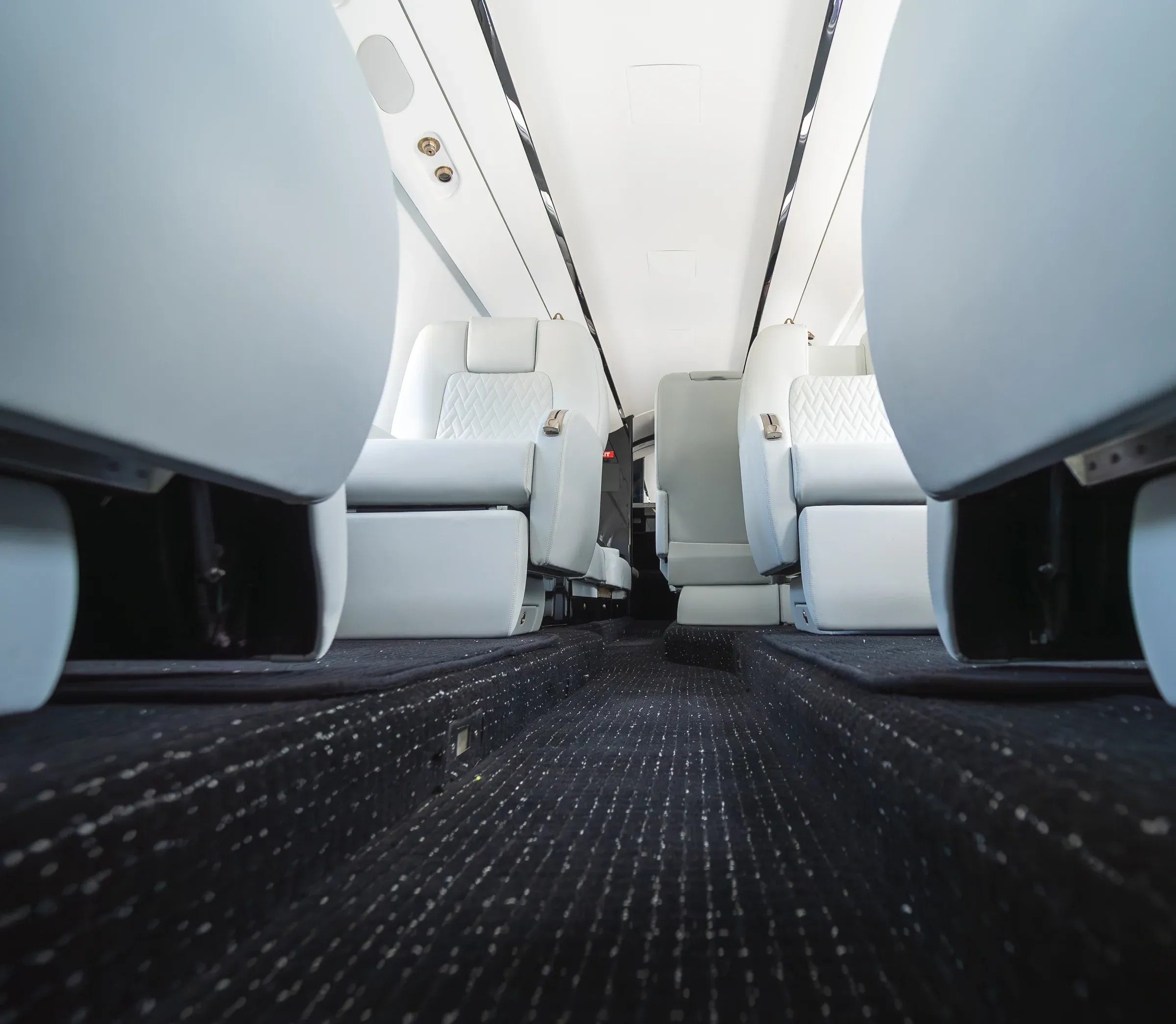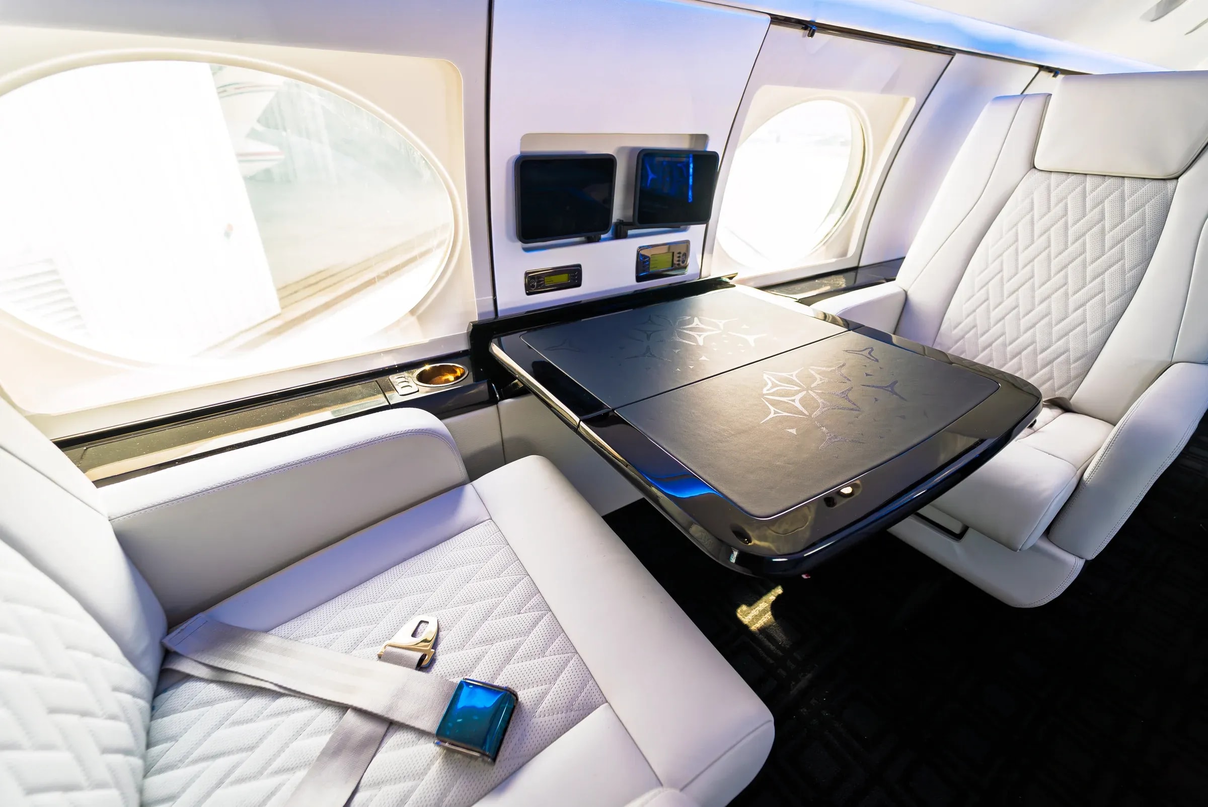
A cabin palette is more than a set of favorite colors. It is the relationship between large surfaces, smaller details and the materials you experience together. A seat, a cabinet finish and a carpet sample may each be attractive on its own while suggesting different directions when placed side by side. The most useful starting point is to choose an anchor, decide where contrast belongs and review the complete combination before adding more accents.
Choose the element that sets the direction.
Your anchor may already be in the aircraft. If the cabinetry will stay, use its visible tone and texture as a reference for new seating and carpet. If the seating is the main focus, begin with the broad upholstery direction and consider the surrounding materials alongside it. An anchor gives every later choice a clear context. Without one, it is easy to compare samples independently and lose track of the interior they are intended to create.
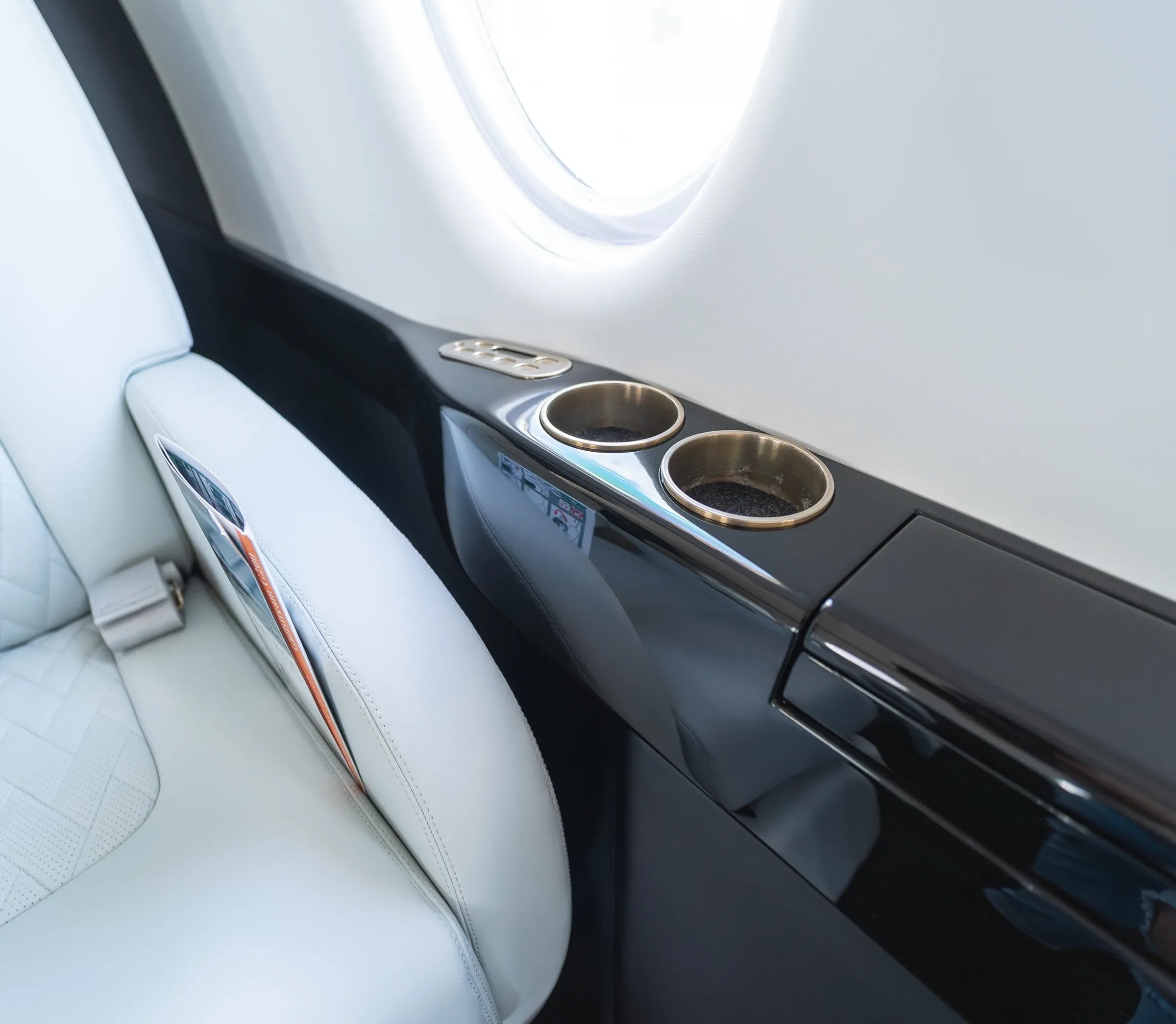
Describe the relationship before naming the color.
Try a short statement such as “light seating with deep surrounding finishes” or “a dark seat with a restrained warm accent.” This is more specific than collecting several attractive color names, because it explains the role each material plays. Names such as ivory, graphite or walnut can be useful visual shorthand. They are not supplier references, and a color extracted from a photograph does not confirm the product used in that project.
Read two real interiors as design references.
| Aircraft | Visible relationship | Question for your cabin |
|---|---|---|
| Gulfstream G550 | Pale geometric quilting sits beside glossy dark tables and gold-toned details. Flowing lines in the carpet add another scale of pattern. | Useful question: should the seating lead through contrast, or should the new colors sit closer to the retained surroundings? |
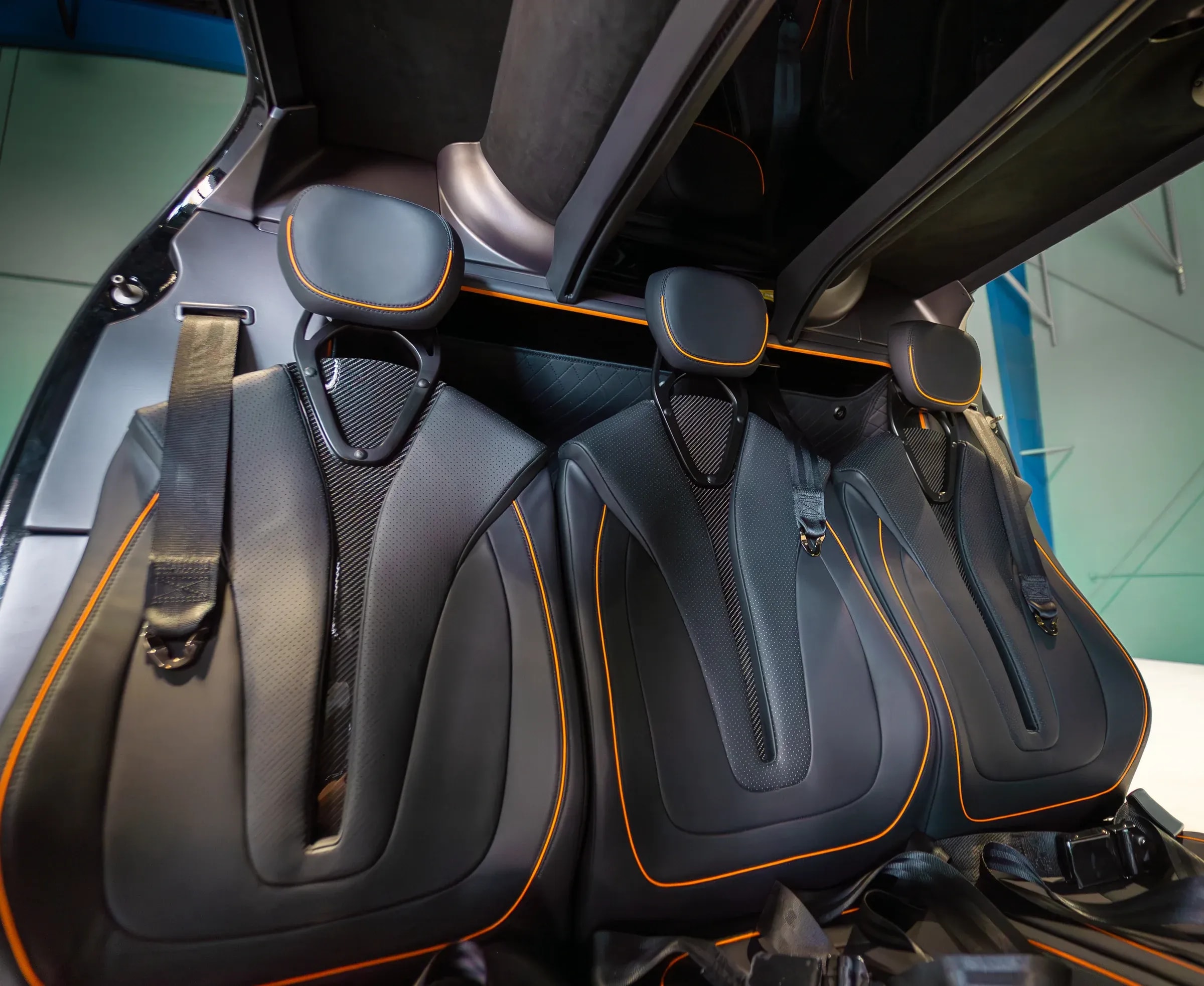
| Bell 407 | The seat surfaces are dark and the warm contrasting piping traces selected edges. A relatively small accent has a clear visual role. | Useful question: where could one personal accent be repeated without introducing several competing colors? |
Consider the size of each surface.
A color on an embroidered initial occupies a different place in the composition from the same color across every seat insert. Review both the material and the amount of it you expect to see. A small accent can be more prominent when it is repeated throughout a cabin. Conversely, a color that looks expressive in a tiny swatch may feel quieter when its surrounding materials are close in tone. Use the wider cabin view to judge that relationship.
Balance pattern with areas of visual rest.
Look at the pattern already present in the upholstery, the cabinet surface and the floor. You do not need to remove every repeated detail to create a coherent interior. Instead, decide which pattern is meant to be most noticeable and let the others support it. Compare a patterned seat against a quieter surrounding finish, then review a more continuous upholstery field with a more expressive surface. These alternatives make it easier to identify what you actually prefer.
Build one direction in a deliberate order.
- Record the materials you will retain and take photographs that show them beside the areas being reconsidered.
- Choose a principal upholstery direction and decide whether inserts and outer panels should feel continuous or distinct.
- Review the cabinetry or Versalles finish alongside the seating, including both its color and its surface pattern.
- Bring the floor into the composition, then add a small set of accents through thread, piping, embroidery or visible hardware.
- Review the combination from the cabin entrance, beside a seat and at close range. Write down which relationship makes the direction work.
Move from the screen to actual samples.
Screens, cameras and lighting influence the appearance of a color and its surroundings. Use a digital palette to communicate intent and narrow the choices you want to discuss. Then compare actual materials with the project team, including the retained surfaces where possible. A finish that looks appealing on a flat sample may read differently beside a curved seat or a reflective cabinet. That is a reason to review the composition together, rather than treating a saved image as a final material match.