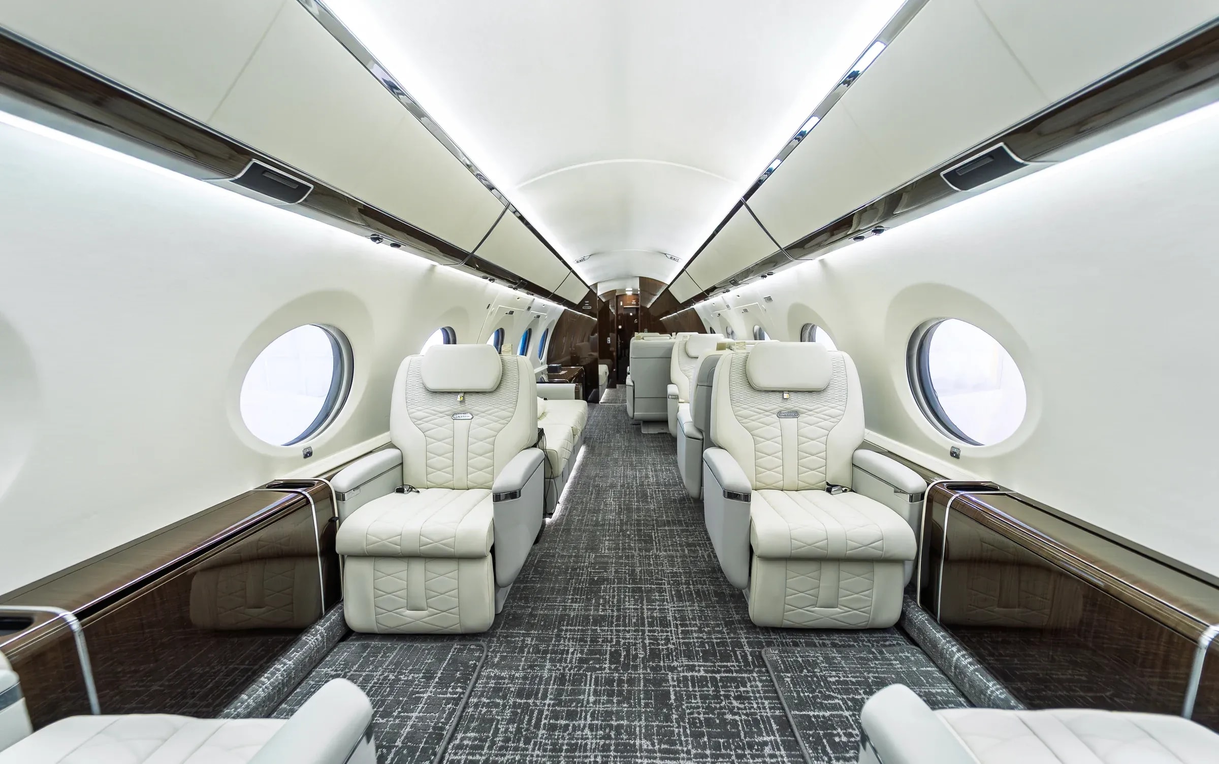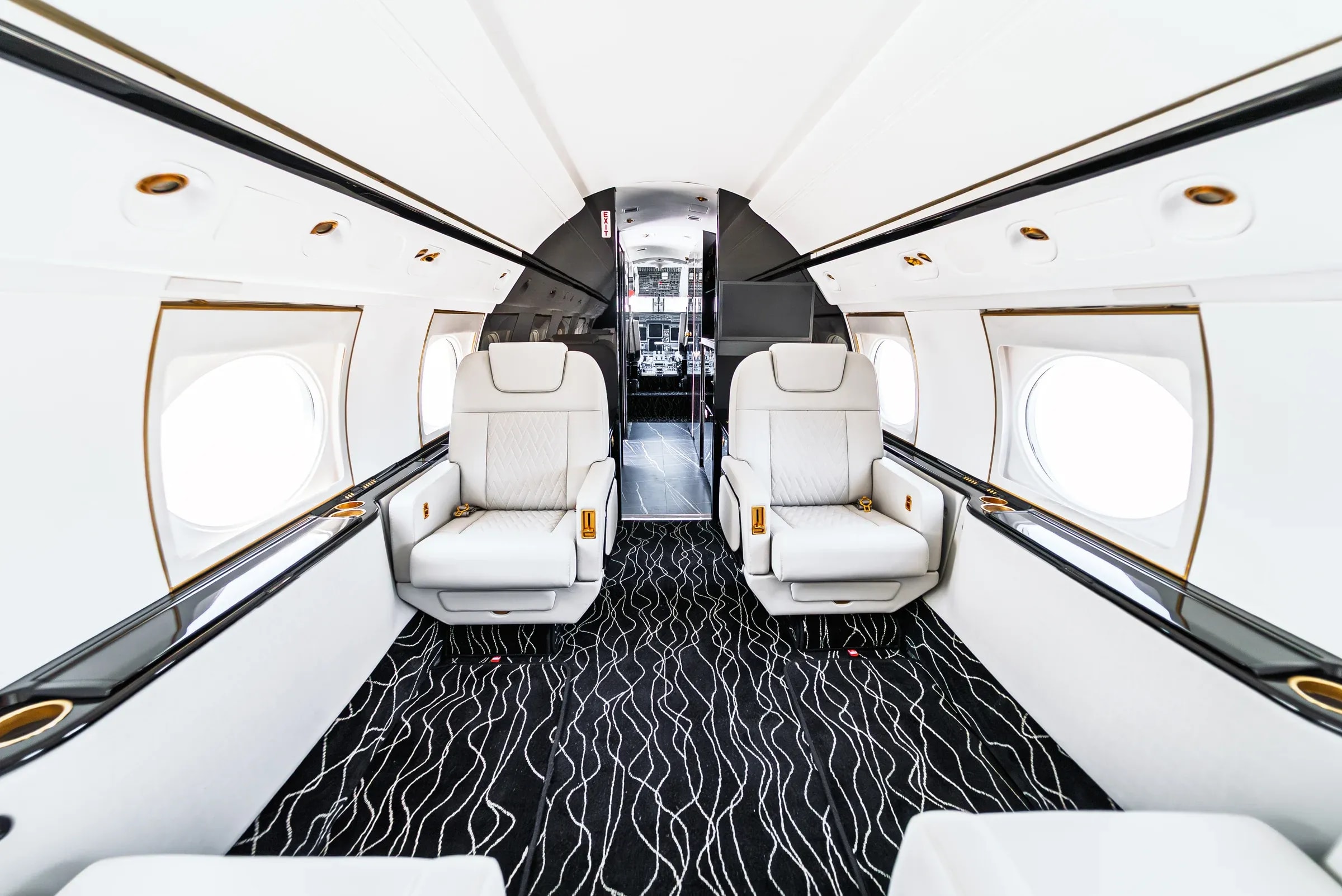
Aircraft upholstery is experienced at several distances. From the cabin entrance, you notice the silhouette and the relationship between the seats. From the aisle, you see the color divisions and the way surfaces meet. At close range, stitching, texture and embroidered details become more apparent. A coherent design considers all three views. Choosing a favorite detail is a useful beginning; deciding where it belongs is what gives the complete seat its character.
Read the seat before adding a pattern.
Start with the shape already in front of you. Look at the headrest, the main backrest panel, the cushion, the bolsters and the armrests. Identify where the form is continuous and where the construction creates a natural division. A contrasting insert can emphasize one area; a related color can let adjacent panels read together. Neither approach is automatically better. The question is whether the detail supports the visual direction you want for that particular seat and cabin.
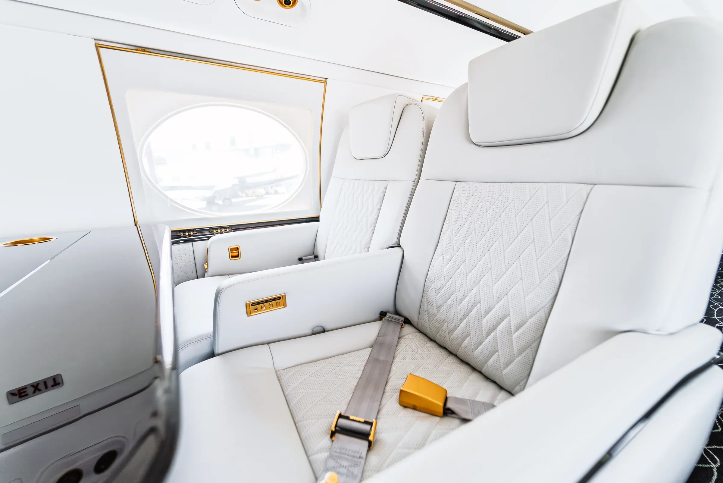
Use the Rex portfolio as a vocabulary.
The G550 photographs show intersecting stitch directions and fine perforations in pale upholstery. In the Bell 407, orange piping traces the contours of dark seats. The G650ER brings elongated geometric quilting together with a central metal badge. These are three visible approaches to character. Studying them helps you explain what attracts you: repeated geometry, a defined outline or a precisely placed accent. The photographs establish the appearance of the completed work; physical materials and execution for your aircraft are reviewed with Rex.
Choose which detail takes the lead.
| Detail | Quiet direction | Expressive direction |
|---|---|---|
| Thread | Tonal stitching stays close to the surrounding upholstery color, allowing the form and surface to carry more of the visual attention. | Contrasting thread makes the seam easier to see and introduces a repeated line into the design. |
| Panel color | Related colors can make an insert and its surround feel more continuous when the seat is viewed from the aisle. | A distinct insert color emphasizes the division between the center of the seat and its outer panels. |
| Pattern | A plain field gives more visual space to the outline of the seat and the character of the material. | Diamond or channel directions introduce a recognizable rhythm that should be reviewed across the complete seating group. |
Give piping a clear role.
Piping is a visible edge detail. In a contrasting color it can trace the outline of a panel and connect a small accent across several seats. Before making it prominent, look at the nearby stitch pattern, the hardware and the cabinetry. A seat can contain several attractive details that compete for the same attention. Try reducing one element at a time: a quieter thread, a simpler insert or an accent used in fewer places. The aim is to make the intended emphasis easy to read.

Treat embroidery as a deliberate signature.
An embroidered initial or short monogram introduces a personal detail with its own shape and scale. Consider its placement, contrast and relationship to the headrest before deciding how noticeable it should be. Review the exact characters and capitalization in the design brief. If you have a custom symbol or logo in mind, share the existing artwork with Rex for discussion rather than assuming a typed monogram represents the final embroidery. The execution is resolved with the team for the actual upholstery.
Review the whole seat in three passes.
- From a distance: does the seat belong to the cabin palette, and is there a clear principal color?
- From the side and front: do the inserts, armrests and outer upholstery feel related, including the parts that are less visible in a single reference image?
- At close range: do the thread, pattern and embroidery support the same direction, and which choices need a physical sample or a conversation with Rex?